
Our design system had been mostly neglected and had never been treated like a real product.
Some semblance of a design system was in place, but far from what would be expected from a product of our size.
Components were poorly constructed
Figma components were old and copy/pasted from Sketch files, which led to them being poorly constructed. They were also spread across 5-6 library files.
Documentation was barebones or nonexistent
Very little documentation existed anywhere for design, content, or engineering guidelines. Because of this, huge amounts of design and tech debt had accrued in the produc and designers were unsure of what patterns to use and when.
No clear ownership
The engineering component library was minimal and out of date and there were no engineers dedicated to components and maintenance. The same problem existed on the design and content side - nobody “owned” the design system and there was no roadmap for improvement.
A new and unfamiliar challenge for me
As a newly appointed manager, I was now in a position to fix this. Owning a design system was not something I had done before or envisioned myself doing, but I dedicated many hours of study to get myself up to speed on best practices and what makes a design system great.
I had ideas on where to start, but I also wanted to ensure our team was taking into account the voice of our users.
We knew the table stakes items that had to be done. As the new owner of our design system, I established three workstreams to attack: revamping the Figma component library, creating robust documentation for designers and engineers, and recruiting help for our engineering component library.
Audits and research
Myself and two other designers created a figjam file to collect UI inconsistencies in our product and identify areas where styles could be unified through the use of a new or existing component.
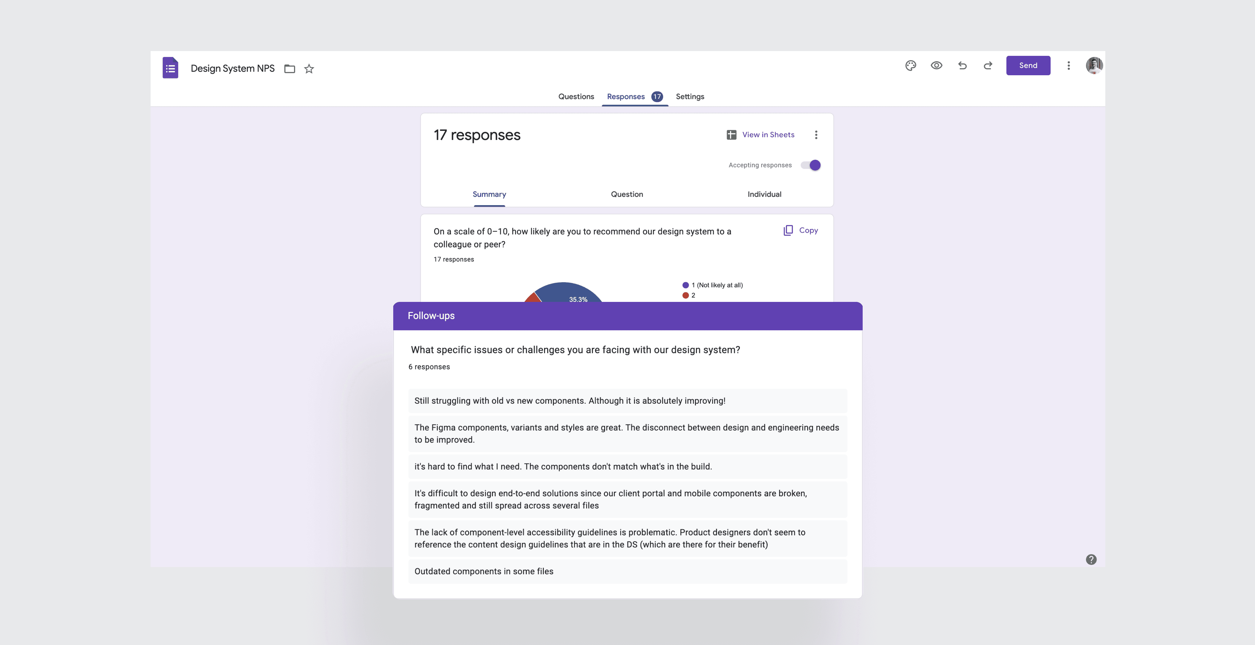
I also set up a recurring quarterly NPS survey to determine the sentiment of our design system from all product designers, and also included a few dynamic open ended questions that were prompted based on how they felt about our design system. We would use these baseline metrics to track against over time as we released improvements.
It was unclear what existed
We quickly learned that using our components was painful, but one of the most common complaints from designers was they never know the "status" of the component. Does it exist in code? Is this the most recent and up-to-date component? Is the documentation a work in progress or is it ready to roll?

It was important to establish a foundation in Figma and work my way out.
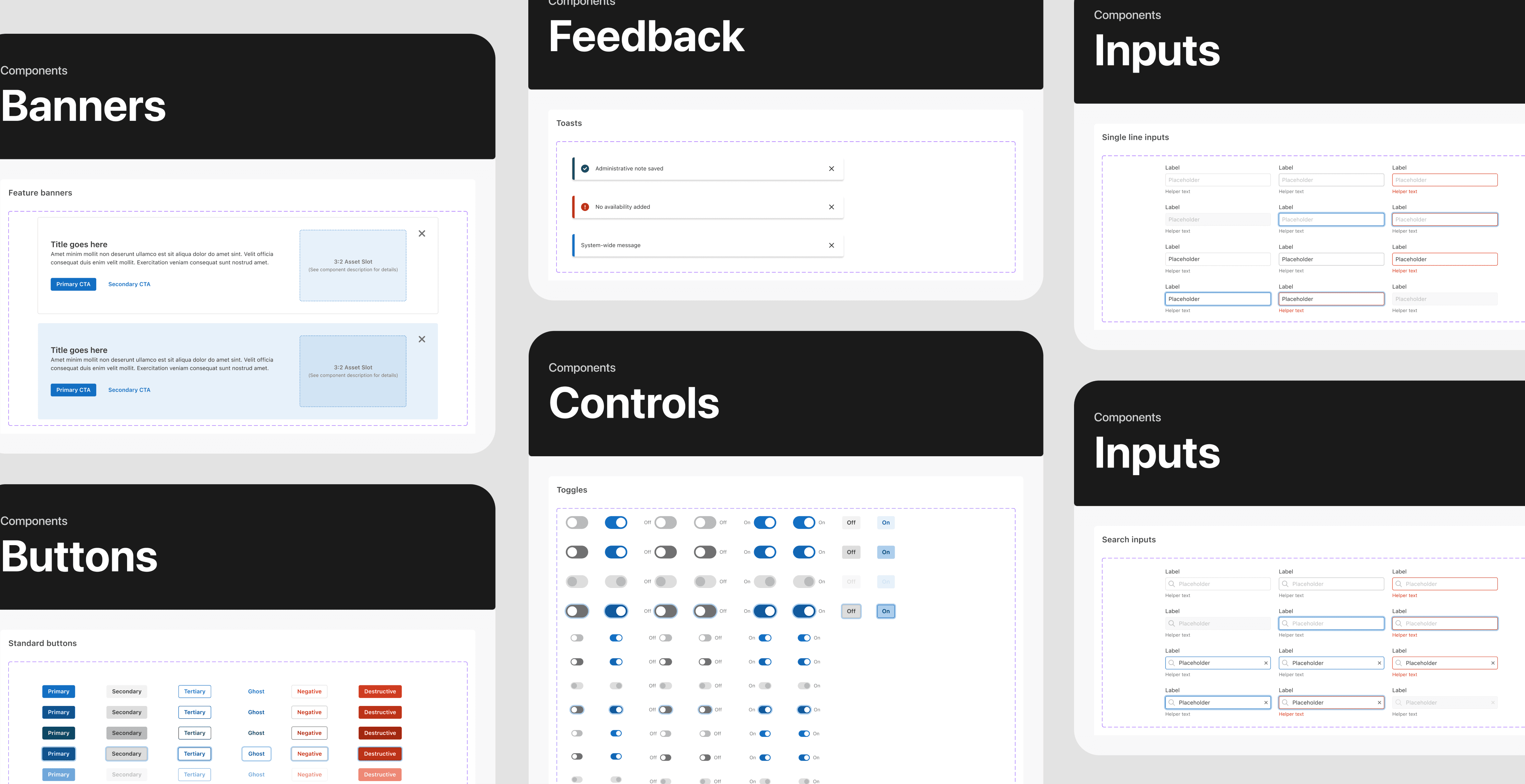
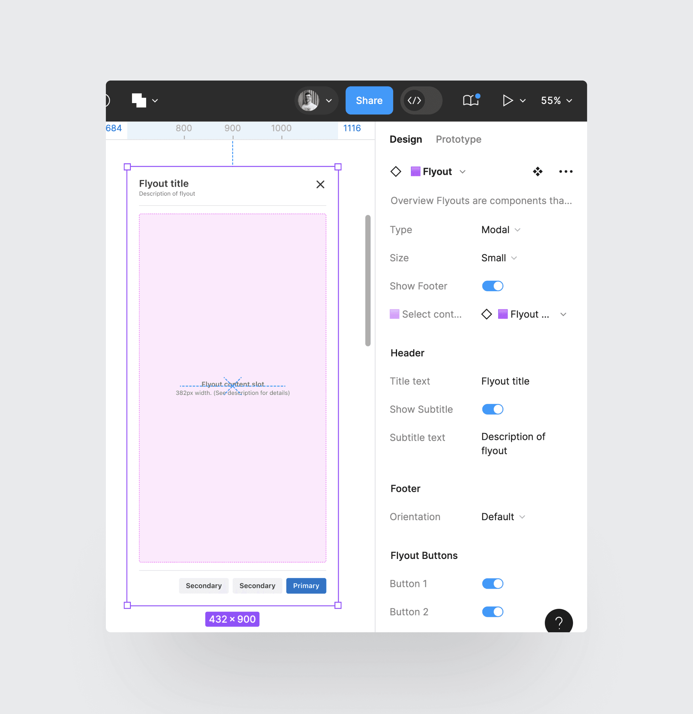
To improve the designer experience, Figma libraries were consolidated down from seven to three main libraries for designers to turn on and reference in their files. Components were rebuilt using the latest Figma technology, building in properties and instance swap to reduce variants and bloat.
A path established for design tokens
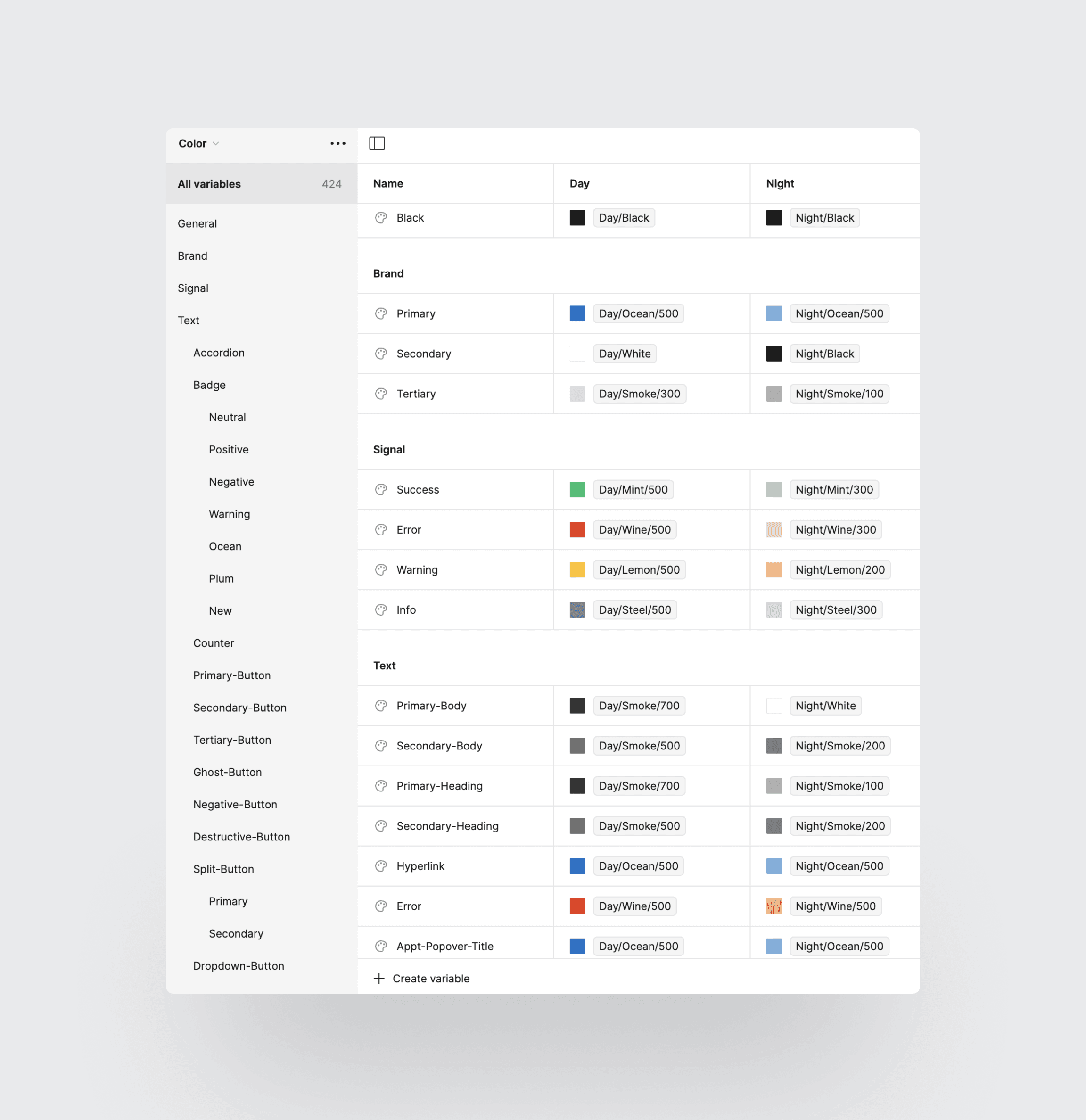
Figma variables were created to establish a path forward for engineers to implement design tokens in the product. The current state of tokens were primitive and had not yet branched into semantic naming.
Creating space for review and asking questions
I created a slack channel for front end-engineers and designers ask questions about patterns or components and quickly get answers in a public forum to build tribal knowledge about our standards and guidelines.


Centralized documentation was paramount to creating shared knowledge and adoption.
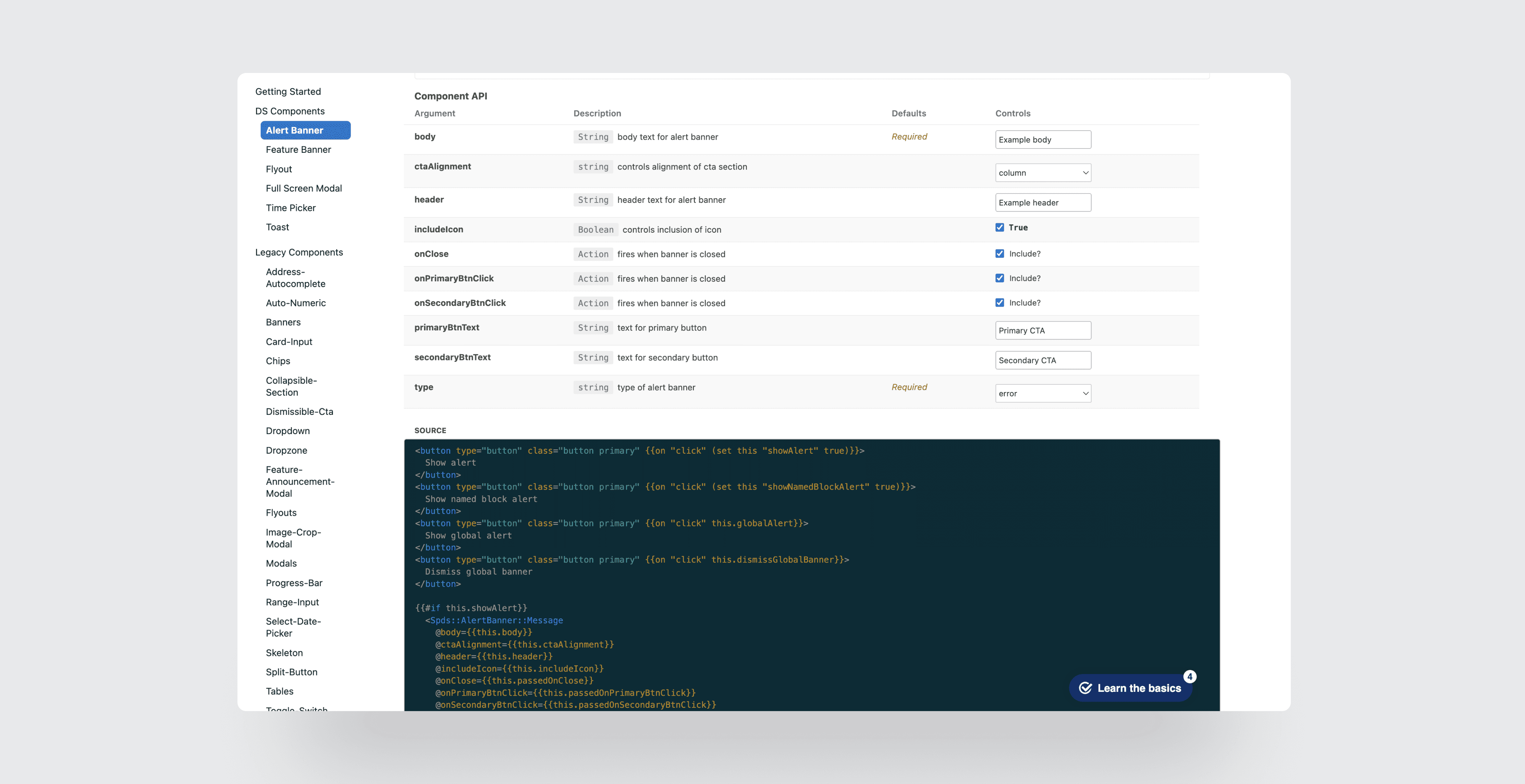
We selected Zeroheight as our documentation tool and began building out our design system site containing guidelines and standards for each component.
Evolving our documentation beyond the basics
Our documentation steadily evolved from component guidelines, to content and accessibility guidelines. Then to general design guidance around UX patterns, decision trees on when to use what pattern, and foundational design principles for our product.
After several iterations, our design and content language had been firmly established and documented in an accessible way to all teammates.
Clear statuses for designers and engineers
A clear status system was established to inform all users which components were up to date, and which still needed some work before use.


Engineering help was recruited close the gap between Figma and code.
I successfully lobbied for dedicated design system engineers to work with us to establish best practices, mature our ENG component library, and rip and replace old and fragmented styles with unified components.
Building missing components alleviated pain for all
Missing components were quickly prioritized to build and addressed the largest pain point reported by our designers and engineers. Over time, the gap between Figma and code became less and less.
Connecting our code made documentation complete
Our front-end team carved out a sprint to revamp our engineering “styleguide” where codified components lived, and connected it Zeroheight. This finally brought us one centralized location for design, content, AND engineering guidelines to live.
After starting with scraps, we now had a real design system.
Building a system is a journey and is never truly “done,” but huge strides were made in our design system.
Measuring success
Measuring the success of a design system is not easy and often vague. We measured NPS for designers and front end engineers who consumed our design system. The first survey established a baseline, and the following surveys showed steady improvement quarter-over-quarter from 0 to 32.
We also set a goal to have all components listed with the status of “stable” on our documentation site. This meant that code was up to date, design components were up to date, and documentation was complete.
We started with ~50% of components listed as stable, and have been able to see an increase of 25% in stable components each quarter since launch as we continue to iterate and ship a better experience for our product and engineering teams.
Designer quotes
"It helps the team with quicker design decisions and a better consistency throughout the product. Love it!"
"Having ready to use components and templates reduces the time I need to spend on a design"
"I love the fact that it's a living doc. I can suggest additions and they're immediately implemented! you guys are on top of it."
"The documentation in ZH makes it so easy to reference with non-designers, and easy to find specific answers for the design team"