SimplePractice clinicians and group practices spend upwards of 8 hours preparing payroll each month.
One of the core business values of SimplePractice is to reduce administrative burden for clinicians to enable them to spend more time with their clients.
Calculating payroll in SimplePractice was painful
CS tickets, interviews, and customer feedback revealed that prepping payroll in the product took 1-8 hours of a group practice owner’s time, and would usually happen twice a month. Often, practice owners had to combine multiple reports to gather necessary information for payroll calculations. This required exporting data from different report tables into spreadsheets, deleting columns, copy/pasting, and then exporting into third-party software.
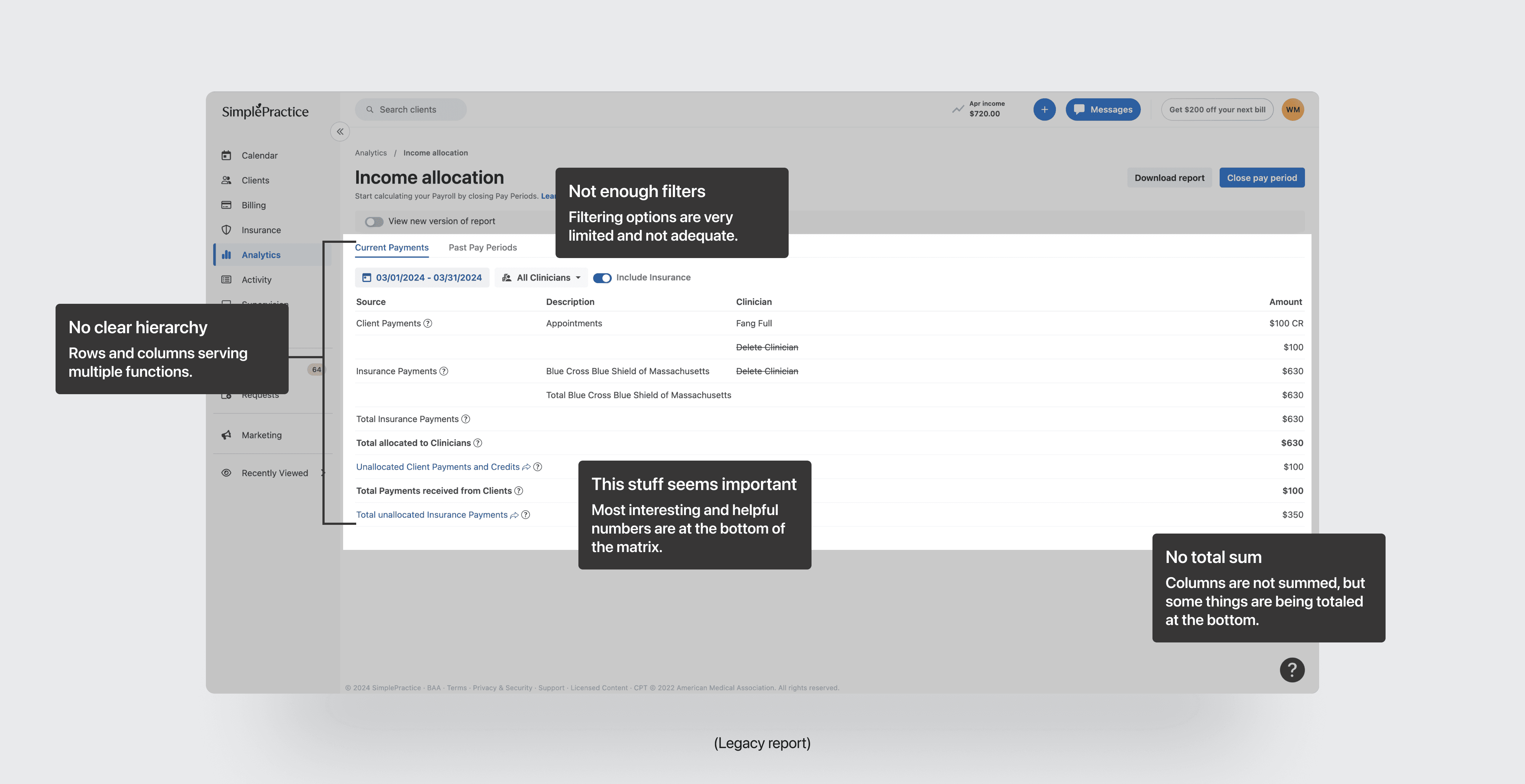
Details in the existing income report were sparse
The legacy Income Allocation report was a confusing matrix table with limited or no ability to drill-down into the details of a total number. This left clinicians in the dark on the details of the report, and did not inspire confidence that the report was even correct.
Confusion with our system
Our users frequently wrote in to our CS team and gave product feedback that our income report was just hard to understand. There was a lack of explanation, a lack of details, and it was painful to use for almost all of our users.
User interviews made it clear that users struggled with the lack of detail in the existing report.
Multiple rounds of discovery interviews, involving myself, the PM, and a CS rep with intricate product knowledge, were conducted to unravel the problem.
Clinicians were wasting very valuable time
A common theme with our users was that they were spending hours manually tracking down payment details in the system and exporting to spreadsheets to calculate totals outside of the product due to the lack of detail and transparency in the report.
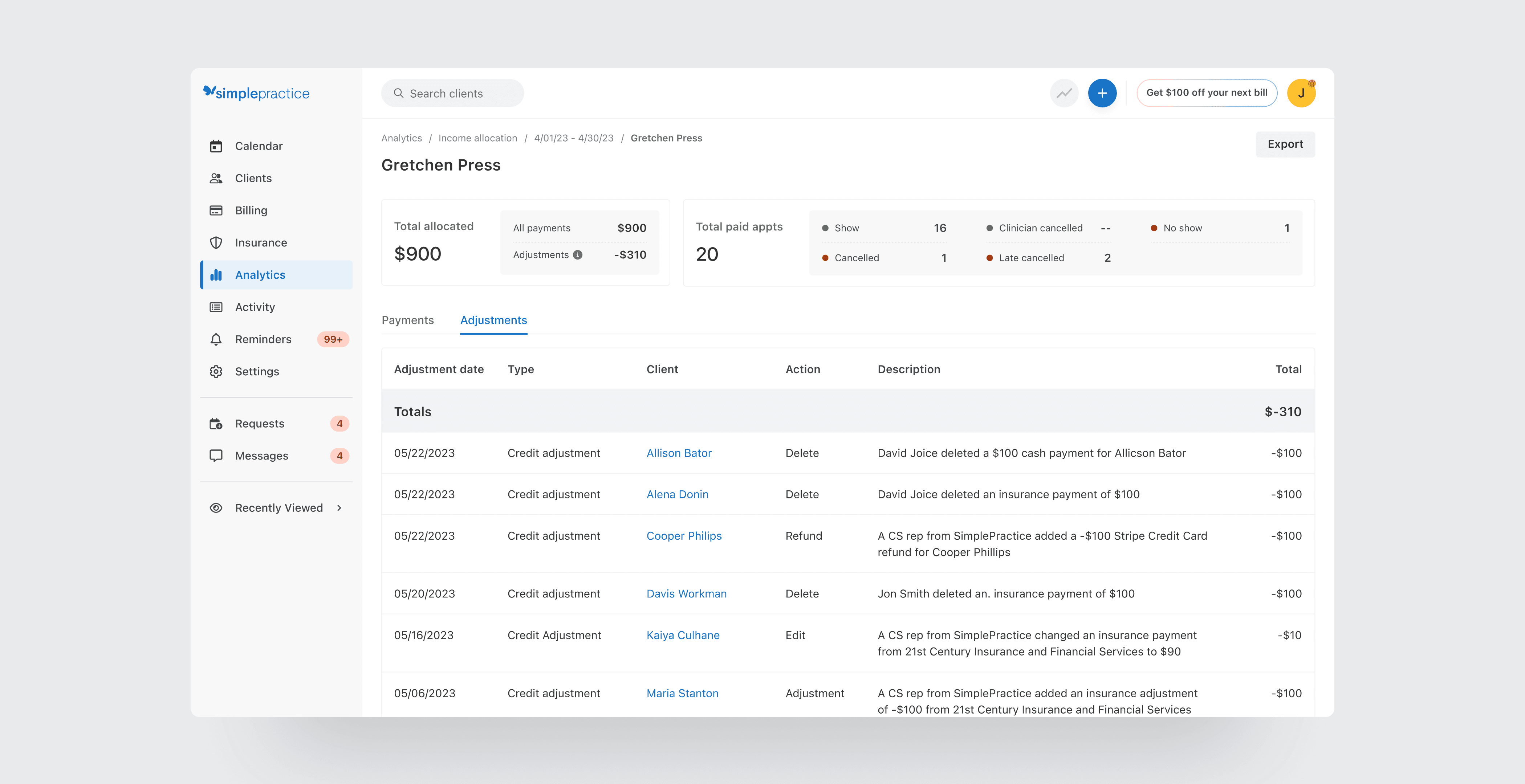
Pay period “adjustments” in the system were hard to decipher
Adjustments were payment corrections meant to reflect changes or edits to the prior pay period. These were shown in the legacy report after closing a pay period without explanation or links to what led to the correction, and were the most common complaint from users. They did not know where these numbers came from.
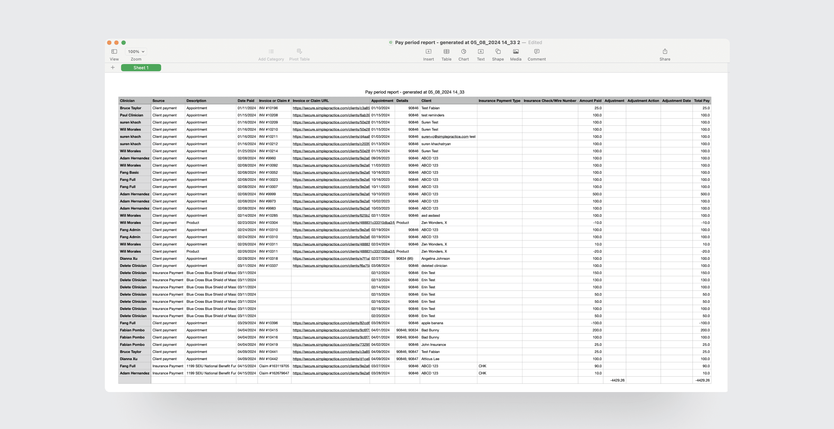
The data export of the report was fragmented and incomplete
The common payroll workflow for our users was to create a pay period in our system, export the data, and then use that export to drop into a third-party system like Gusto or Quickbooks. The existing data export lacked rich details and users told us they frequently had to reformat the export file and fill in with additional data.
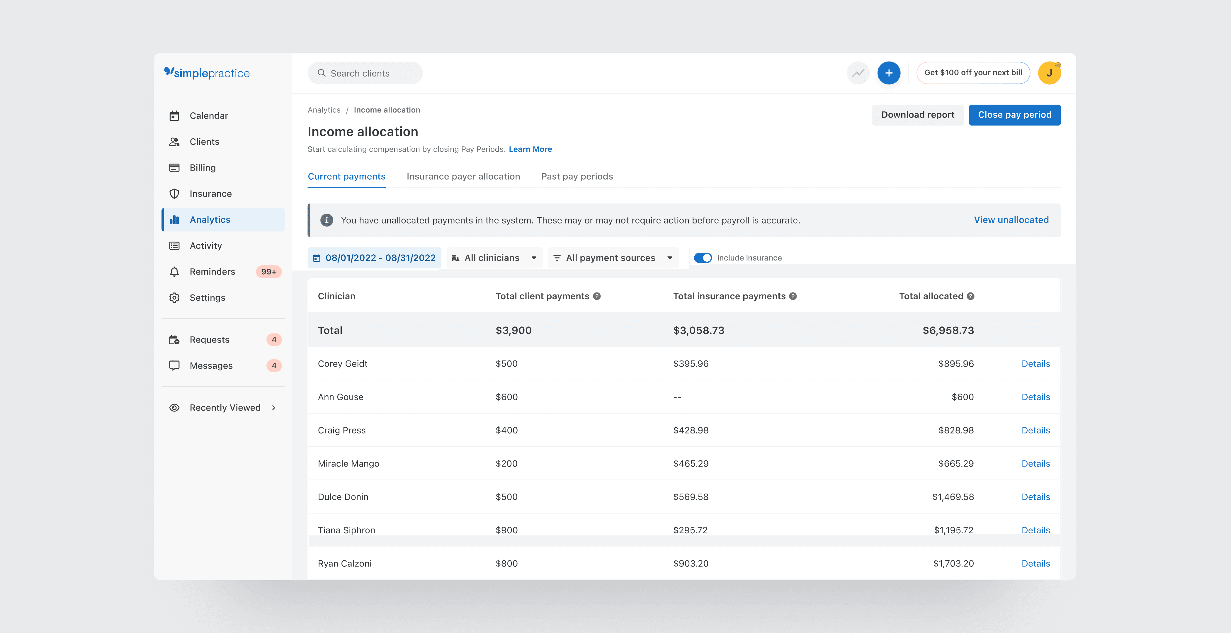
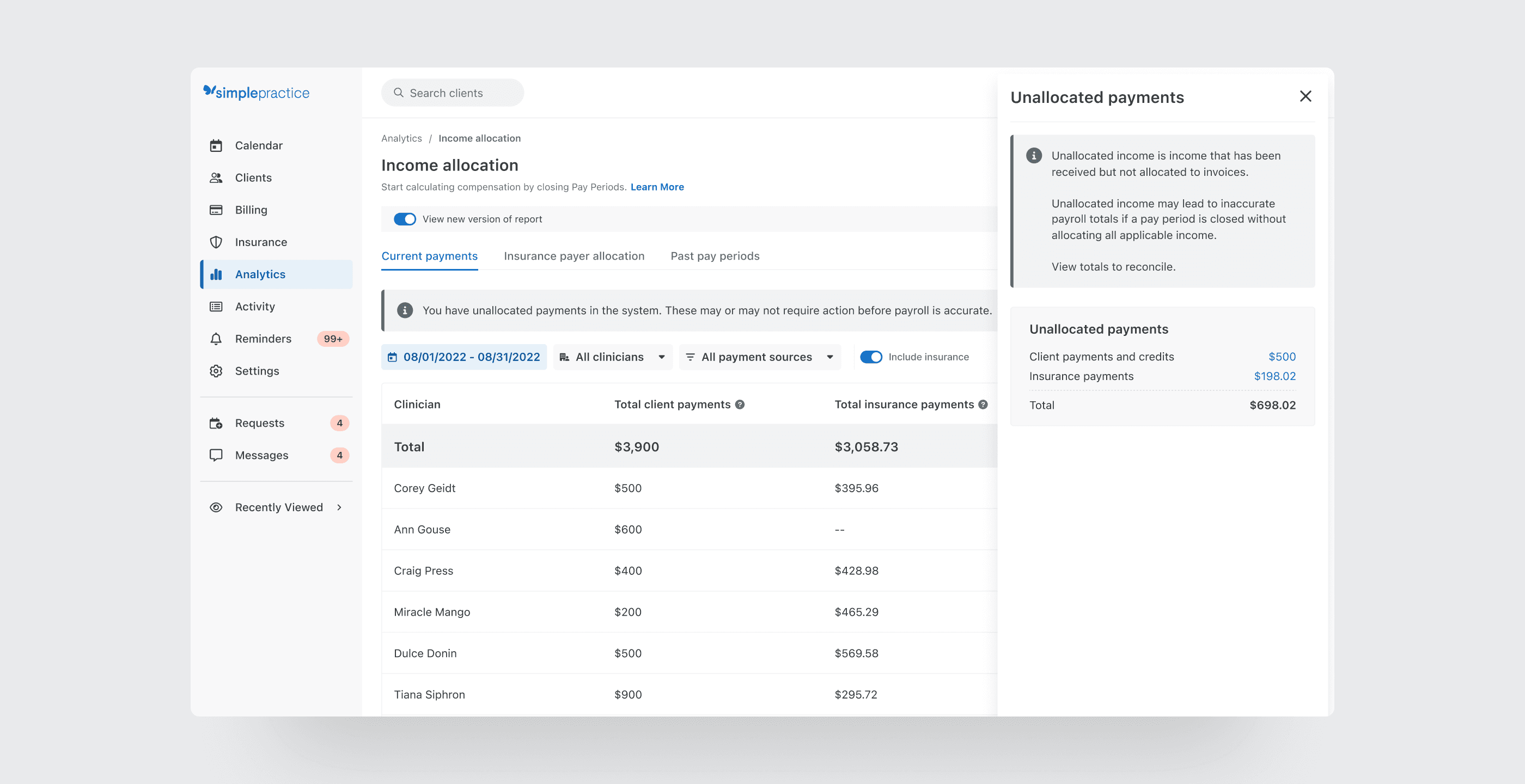
Unallocated income was also hard to decipher
Unallocated income in the system means that there is record of payment to a clinician, but it is not allocated to an invoice or appointment. This lead to a “floating” number in the report that clinicians were not sure how to handle or make sense of. In some cases, there is action needed to allocate it, and in others, it’s a result of a pre-payment for future appointments and there is no action to take.


Our user feedback and discovery led to iterations of a more interactive table format.
My initial idea was to rethink the report experience to be a more traditional table format with clear columns and rows to aggregate data points per clinician, and at the practice level to give the macro view of the practice during a given pay period.
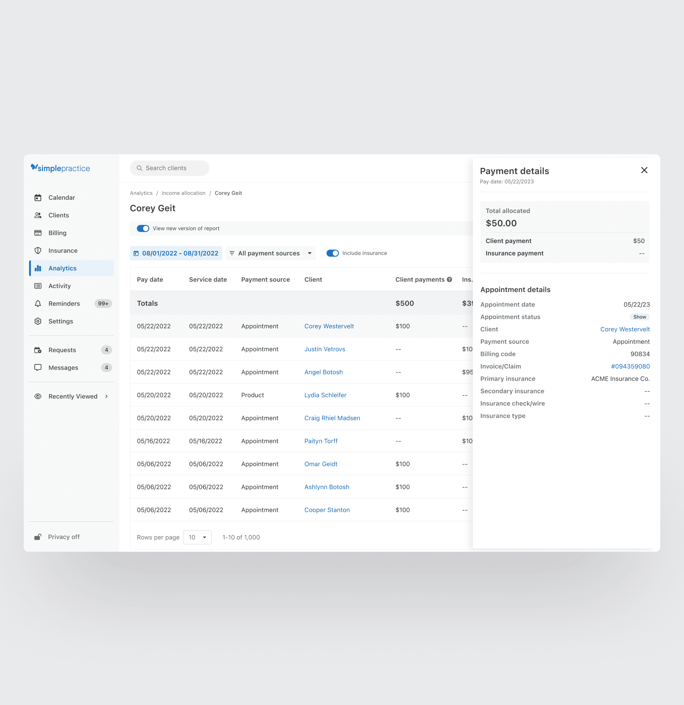
Flyout components were created to provide the extra details
Table rows and columns were able to provide the primary data, but additional context of each appointment and clinician total was still missing.
A row action to open a flyout could provide the necessary info to create trust and insight into the number.
Improved filtering to maintain functionality
It was important to not remove any information from the existing report. The legacy report was difficult to decipher, but there was good info in there that we didn't want to lose. My hunch was better filtering and user-controlled segmenting of data within the report would maintain existing functionality in a more approachable manner.

Testing different solutions revealed that aggregating totals and providing detailed breakdowns significantly enhanced the report's usability.
Figma prototypes were shared with group practices of different sizes and users were prompted to interact with the prototype as if they were calculating a pay period. Feedback was incorporated into design iterations as we dialed in the experience.
Aggregate and clinician totals provided immediate value
The new report design was a more traditional table with totals anchored at the top for scannability and quick lines of sight into the breakdown of income received by column. This was a much cleaner line of sight into income generated by each clinician, what payment source it came from, and also a cleaner picture of how the practice as a whole performed.
Drill-down details provided trust in the number
Data points and explanatory information were added into “details” flyouts that opened over the table for each row, giving users the contextual info they had been missing in the legacy report. This gave them confidence the number was correct and transparency into the system's accounting.
Details of adjustments were provided
I worked with the engineering team to uncover what system events created adjustments in pay periods. We were able to give labels to these events and extract their data points into a log for each clinician in the pay period.
This gave our users the detailed history they had been missing, eliminating the need to spend hours trying to track down in the system.
A detailed page was created for each clinician
Clicking on the clinician name in a pay period created a detailed drill-down page to provide all data points and an individual "mini report" for each clinician in the practice. This painted a full picture of the pay period, providing rich appointment data needed to understand aggregate totals show performance data of the clinician.


Unallocated income was highlighted with explanation and clear actions to reconcile.
Floating income in the pay period that was not tied to an invoice was clearly called out with a banner appearing on top of the report.
A gentle reminder, not a warning
It was important to display the information and call attention, but not frame it as a warning. In many cases, the income needed to be reconciled and allocated to a clinician in order for them to receive credit, but sometimes no action needed to be taken due to pre-payments from clients for future appointments.
It was also important to improve the customer experience outside of the product.
While it was important to drastically improve our in-product experience, creating a more seamless out-of-product experience also met customers where they were, reducing time to calculate payroll across the board.
Better data led to a better export
With better filtering and cleaner data in the report, the export file of the report also became much easier to drop into third party payroll solutions like Gusto and Quickbooks.
A complex solution necessitated delivering value through iterative releases.
Due to the complexity of the the report and the depth of the changes, both in backend calculation and visualizing these changes in the UI, we needed to pull the solution apart into manageable chunks to iteratively deliver value to our users.
Starting with export and table redesign
The MLP of this solution was to clean up the export and release with the updated table view to implement the new columns and calcs to provide transparency into the aggregate totals and individual clinician breakdowns.
Rounding out with adjustment and robust appointment data
Later releases brought robust details and new UI elements to include appointment data and totals for each clinician, as well as the in-depth adjustment details to provide the much needed transparency and explanation to our users.

Post-release surveys showed a 29% reduction in payroll processing time and positive feedback from surveyed clinicians.
After release, we measured our success by surveying group practices about the report and time spent calculating payroll after each report.
Time was given back to be spent with clients
This payroll report was successfully able to reduce pain and wasted time for our group practices every pay period, giving back valuable time to be spent with their clients and patients.
Pain was also relieved with our CS partners
Not only did our customers win with this release, our CS peers also experienced a reduction in tickets and questions related to payroll submitted by our users due to the clarity and explanation of the system calculations in the experience.
Customer quotes
"I love having better clarity for group practice payroll clinician totals when handling unallocated amounts."
"We love that it details out what has been adjusted. Thank you!"
"This really cuts the amount of time that I am running payroll!"